Tianjin / TJ_C6
Tianjin — From pier to stage
The path of tea through the river, the counter and the theatrical evening.
Checked for publication · Drawing review and technical check of the current file
Review basis
Retry: Haihe and the other captions are now distinct; the large teapot, goods receiving, pouring, and Xiangsheng are legible. The broad light halos of the previous version are removed; a moderate printed-stroke texture remains, without a cropped title or main subjects.
PNG RGBA 3840 × 1152 px; real alpha channel; proportional export 250 × 75 mm.
Approved after review for the open gallery; does not imply the user's endorsement of industrial production.
Creative brief palette
#255762
#A48235
#C67355
Original generation prompt
Text matches the public TXT. The list of inscriptions and details describes the author's brief; this is not OCR and not a promise of reproducibility without the references used.
SHA-256: 715f0adc1c6812d4a7043cb4b4359ce5cc596eb015722ec12f57d98d2beca4ec
Read the full prompt
RENDERING REQUIREMENTS: Produce a new, completely crisp region-specific illustration. Borrow ONLY drawing style from the references; do not copy their region, title or place names. Use the exact region and English lettering in the brief. No blurred patches, mist, smoky shading, translucent brush smears or soft-focus architectural details. No clipping of objects or letters: keep an 80-pixel clear safety margin around the complete composition. True PNG RGBA transparency between the drawn shapes; no opaque white or coloured backing. Sharp ink edges, legible deliberate lettering.

Create an exceptional original flat illustration for a collectible tea-region ceramic wrap. The attached image is a STYLE reference, not a content reference: preserve its drawing intelligence, print character and relationship between title, scenes and empty glaze; replace every Guangdong-specific subject and word. Output one panoramic native 3840 x 1280 pixel PNG with a genuine RGBA alpha channel. All artwork, including lettering, must remain wholly inside x60..3780 and y110..1170. The upper and lower outside bands and the external negative space must be transparent, not white paint. The final production crop will be 3840 x 1152 pixels for a 250 x 75 mm wrap; do not draw dimensions, crop marks or a frame. No mug, mockup, photograph, simulated paper, decorative rectangular background, cast shadow, checkerboard or watermark.

DRAWING AND PRINT DISCIPLINE: Use confident authored linework, recognisable local silhouettes, selective flat colour and well-resolved hands, vessels and architecture. Details reward close looking but the main story reads across a small ceramic surface. Colour belongs to actual drawn objects or deliberate bounded accents. Transparent sky, river openings, architectural gaps and open vessel interiors are part of the design. Do not use a continuous opaque landscape base, atmosphere wash, cream substrate or enormous filled silhouette behind everything. Keep deliberate pauses between major masses without making a sticker sheet. Never cut off a letter, roof, person, handle or tree at the image boundary. Do not scatter repeated generic teapots as filler. Each featured tea action must communicate a different part of the region's tea story. This is an illustrated interpretation, not a navigable map: no compass, coordinate grid, dotted connectors, numbered pins, legend or tiny labels.

COLLECTION C6 — JOURNEY LINES.
Three-ink energetic angular drawing with bold slanted regional lettering, directional hatching and a dynamic diagonal or shallow S-shaped journey across the width. A near tea craft or hospitality action has dramatic scale; landmarks recede behind it. Regional movement gives the line a purpose. Strong recognisable silhouettes and intersecting depth planes, not scattered stamps, comic panels, scribble chaos or generic adventure badges. Keep angular energy legible and preserve clear transparent channels.

REGION: TIANJIN. EXACT PALETTE: #255762, #A48235, #C67355. Use only these opaque graphic inks and their clean antialiased edges; no white ink, black substitution or extra colours. Transparent negative space is not an additional ink.

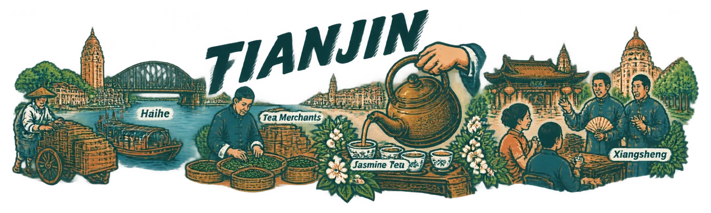
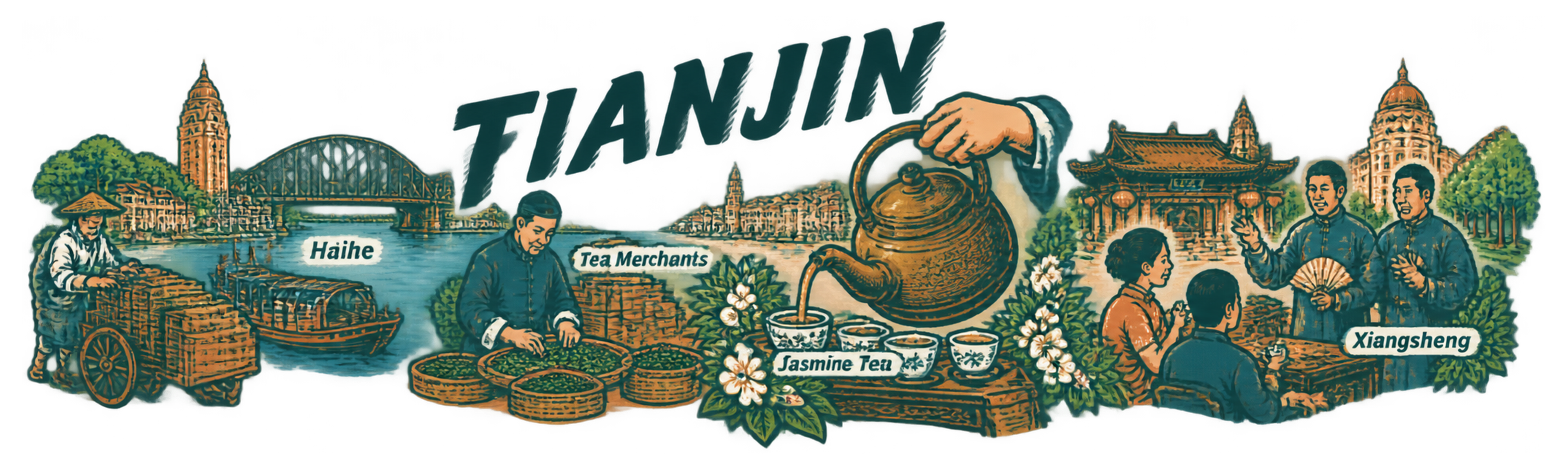
At far left an unbranded tea chest on a handcart stands beside a small Haihe boat. An S-shaped riverside movement bends through a merchant weighing leaves, then swings forward into a very large server's kettle and complete pouring hand. The pour leads visually toward tea-drinking listeners and a xiangsheng pair at the right. Behind them, Jiefang Bridge's truss, Tianhou eaves and a restrained Wudadao facade punctuate the city. Draw no invented commercial shipping route map or giant steamship overwhelming the tea people.

REGIONAL TRUTH: Tianjin is a northern tea-trade and tea-drinking city, not a tea-growing province. Its established jasmine-tea merchants obtained and processed supplies in southern tea regions before bringing tea to Tianjin. Zhengxingde is documented evidence of this merchant culture, but no brand logo is needed. Qianxiangyi is a documented teahouse performance venue, supporting the combination of xiangsheng, tea tables and social listening. The Haihe, merchant architecture and port identify the city. Any tea stockroom in the artwork is an interpretive trade scene, not an invented named tea museum. Do not invent local tea fields, a special Hakka sweet tea or export-market statistics.

SPECIFIC COMPOSITION: Slanted TIANJIN is placed above the inward bend. Angular line direction links cart, bridge and kettle spout but all three remain realistic objects. Keep the river clear and architecture line-based. Complete the projecting hand and kettle far inside the safe margins, never clipping to create drama.

TEXT: Main title exactly "TIANJIN". Secondary labels, each once and attached to its correct scene: Tea Merchants; Haihe; Jasmine Tea; Xiangsheng. No other text.

FINAL ART DIRECTION: Make every major group different in scale and gesture. Do not give every scene a surrounding halo or a separate base. A viewer should discover a clear regional idea at arm's length and then human actions, leaf shapes and local building features nearby. Keep the specified palette visible as actual graphic inks, not merely a tint over green scenery. Do not add unrequested slogans, stamps, logos, dates, Chinese characters or gibberish. The exact allowed English words below are the entire text vocabulary. Keep secondary words comfortably readable if allowed; omit a minor caption rather than shrinking it to microscopic lettering. Render the regional title exactly once and complete, with comfortable space around it. No extra title repeated on vessels or buildings. Draw a finished cohesive piece of print art, never a presentation board.