Ганьсу / GS_C5
Ганьсу — Парад достопримечательностей
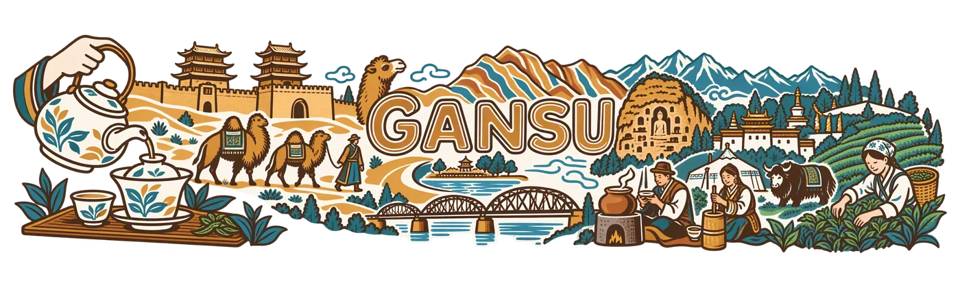
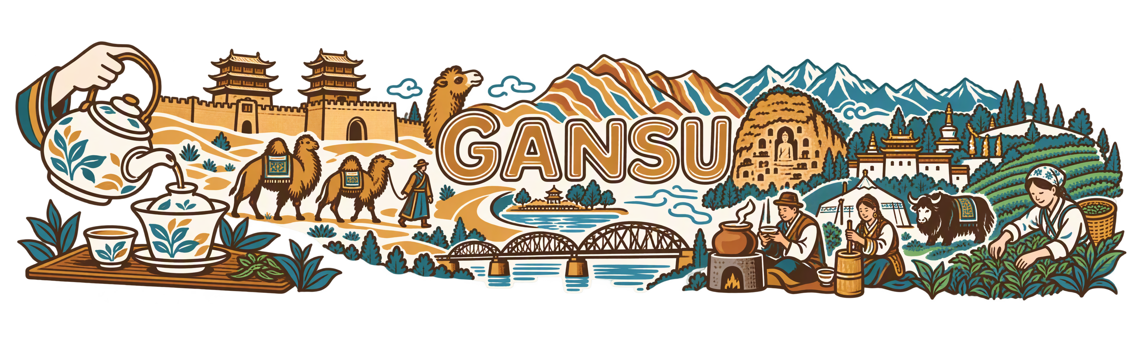
Добродушная процессия: гайвань, верблюды, Данься, як и сборщик; двойной контур названия.
Проверено для публикации · Просмотр рисунка и техническая проверка текущего файла
Региональное исследование и источники
Основание проверки
Чёткая округлая трёхцветная графика: крупный чайный жест, караван, крепость, мост, молочный чай и сбор листа. GANSU читается; нет микронадписей или размытых ореолов.
PNG RGBA 3840 × 1152 px; настоящий альфа-канал; пропорциональный экспорт 250 × 75 мм.
Допущен после просмотра для открытой галереи; не означает утверждение пользователем промышленного тиража.
Палитра авторского задания
#564238
#B97D2E
#428A99
Точное текстовое задание
Текст совпадает с публичным TXT. Перечень надписей и деталей описывает авторское задание; это не OCR и не обещание воспроизводимости без использованных референсов.
SHA-256: a44424fd327337d5784755169875e41515cda99d21e96b78e2c723ca7e9042e2
Прочитать полный промпт
Create one exceptional, completely flat regional ceramic-print artwork. This is the actual printable illustration, never a cup, product photograph, mockup, presentation board or simulated ceramic surface. The collection reference controls drawing language only: invent a new composition for the specified region and replace all Guangdong-specific objects. The source map supplies a regional inventory, not a paper texture or a layout to trace literally.

TECHNICAL CONTRACT: native canvas exactly 3840 x 1280 pixels, true RGBA PNG. Keep every visible mark, letter, ornament and antialiased edge inside x=60..3780 and y=110..1170. The final delivery will use a centered 3840 x 1152 export for a 250 x 75 mm wrap; leave the native safety area completely transparent. Compose for a long horizontal physical print, not a conventional poster. Nothing is cut off at either end. All exterior space and meaningful holes between objects must have alpha zero. No painted background, white underpainting, sky rectangle, tinted paper, land silhouette, colour fog, opaque backdrop or checkerboard. The wearer-visible ceramic supplies the unprinted space. Use the specified colours as ink, with normal edge antialiasing; do not invent extra white, black or metallic ink. Never print dimensions, crop marks, palette swatches, filenames, reference names or instructions.

ART DIRECTION: create a memorable hierarchy, a major focal scene and a quieter counterweight; alternate large close forms with medium stories and a few small discoveries. Let tea life interact with the region. Connect selected objects through a real roofline, tabletop, lane, ridge or river contour; retain clear breathing channels so each gesture and vessel is legible. Do not impose any percentage of empty space. Avoid both a cramped rectangular carpet and timid isolated stickers. Use confident, intentional linework that will survive the 75 mm print height. Limit texture to useful material clues. Any water, snow, steam or clouds are sparse outlines with transparent interiors, never washed fills. No photographic gradients, glow, heavy grunge, blurred edges or tiny illegible hatch fields.

FACTUAL DISCIPLINE: the scenes below distinguish cultivation, processing, trade, hospitality and non-tea infusions. Do not turn imported tea, berries, ginseng, barley, trees or grasslands into tea plantations. Do not invent a local tea cultivar, a named historic tea shop, medical effects, a precise trade route or archaeological evidence. Landmarks are cultural/geographic motifs, not assertions that tea was grown or traded at their gates. A contemporary tea pause next to a landmark is an authored scene, not a documentary historical claim. Keep people natural and respectful, with plausible hands and gestures; use no decorative pseudo-script.


C5: BOLD FRIENDLY LANDMARK PARADE. Confident rounded pen turns, double-contour regional lettering, reduced architectural silhouettes and a joyful procession of people, local travel motifs, vessels and landmarks. Three flat inks and spare patches of colour. Vary height and scale sharply; objects overlap through useful shared contours rather than being pasted in one equal-sized row. Tea must remain a visible living action in this mixed regional collection. Rounded does not mean infantile, and friendly does not mean generic.

REGION: Gansu. Exact ink palette: #564238, #B97D2E, #428A99. The first colour supplies the main line; the others have deliberate separate roles, not gradients.

AUTHENTIC SUBJECT MATTER:
Gansu is an extraordinary transition from desert corridor to humid southern mountains. Include a compact Jiayuguan gate and short crenellated wall, two Bactrian camels with a guide, a crescent spring and sparse oasis tree, a few striped Zhangye Danxia ridges, the angular Qilian skyline, and the curved steel-truss bridge across the Yellow River at Lanzhou. Counterweight these dry northern forms with the wooded Longnan tea valley. Add a small Maijishan cliff facade, a modest Labrang roof group, and one yak near a pastoral tent. Use these as recognizable geographic objects at deliberately unequal sizes, not every monument as a giant equal hero. Mogao may be suggested by a small arched cave entrance rather than a large sacred portrait. No painted desert or river fill. Tea appears through actual people and vessels, integrated into the journey.

Tea anchors that remain visible: Wenxian green-tea picking, a Sanpaotai gaiwan with a pouring hand, Tianshui clay-pot tea on a stove, and a small Gannan butter-tea bowl/churn; the first is cultivation, the others are drinking customs.

SPECIFIC COMPOSITION:
A good-humoured procession begins with a large pouring kettle and three-piece Sanpaotai gaiwan at the left, passes a compact double-towered Jiayuguan gate and two unequal camels, rises into the striped fan of Danxia, then relaxes into a yak and a tea picker at the far right. The word GANSU is a bold double-contour landmark in the center; allow one camel head and one leaf basket to overlap its outer spacing without obscuring letters. Under the central word a short Lanzhou bridge and crescent spring provide different low shapes. One clay-pot stove and one Longnan leaf tray are significant secondary details. Keep hands, kettle spout, camel humps and yak anatomy simple and clear; no uniform emblem row.

VISIBLE TYPE: exact main title "GANSU" once. The regional title is the only printed text. Do not add small location labels. No Chinese characters, bilingual captions, pseudo-calligraphy, gibberish, slogans, logos or signatures. Prioritize visual storytelling over words. Do not allow letters to merge with foliage or buildings. The design must feel like a collectible regional artwork that a tea professional would want to handle and study.