Liaoning / LN_C2
Liaoning — Large letters — tea worlds
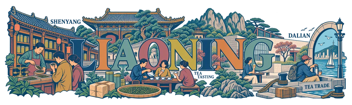
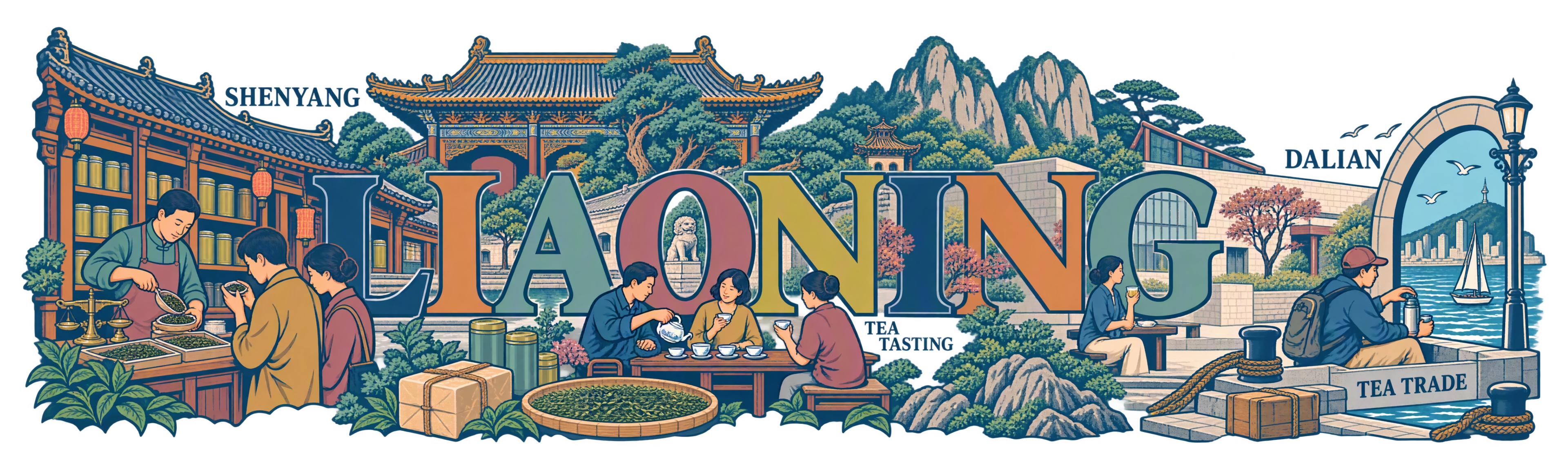
LIAONING becomes a tea street: scales, tasting, palace and embankment interact with the letters.
Checked for publication · Drawing review and technical check of the current file
Review basis
LIAONING whole; large letters are connected with clear scenes of tea trade, tasting, and the Dalian port. Captions are legible, the drawing is sharp, southern tea plantations are not invented.
PNG RGBA 3840 × 1152 px; real alpha channel; proportional export 250 × 75 mm.
Approved after review for the open gallery; does not imply the user's endorsement of industrial production.
Creative brief palette
#2A527D
#D08A55
#7FA59A
#AB6271
#BDA747
Original generation prompt
Text matches the public TXT. The list of inscriptions and details describes the author's brief; this is not OCR and not a promise of reproducibility without the references used.
SHA-256: d072575c65265636d3fb9444a90bad462187f09d534ef4dca4a5b34c2e1e3734
Read the full prompt
Create one exceptional, completely flat regional ceramic-print artwork. This is the actual printable illustration, never a cup, product photograph, mockup, presentation board or simulated ceramic surface. The collection reference controls drawing language only: invent a new composition for the specified region and replace all Guangdong-specific objects. The source map supplies a regional inventory, not a paper texture or a layout to trace literally.

TECHNICAL CONTRACT: native canvas exactly 3840 x 1280 pixels, true RGBA PNG. Keep every visible mark, letter, ornament and antialiased edge inside x=60..3780 and y=110..1170. The final delivery will use a centered 3840 x 1152 export for a 250 x 75 mm wrap; leave the native safety area completely transparent. Compose for a long horizontal physical print, not a conventional poster. Nothing is cut off at either end. All exterior space and meaningful holes between objects must have alpha zero. No painted background, white underpainting, sky rectangle, tinted paper, land silhouette, colour fog, opaque backdrop or checkerboard. The wearer-visible ceramic supplies the unprinted space. Use the specified colours as ink, with normal edge antialiasing; do not invent extra white, black or metallic ink. Never print dimensions, crop marks, palette swatches, filenames, reference names or instructions.

ART DIRECTION: create a memorable hierarchy, a major focal scene and a quieter counterweight; alternate large close forms with medium stories and a few small discoveries. Let tea life interact with the region. Connect selected objects through a real roofline, tabletop, lane, ridge or river contour; retain clear breathing channels so each gesture and vessel is legible. Do not impose any percentage of empty space. Avoid both a cramped rectangular carpet and timid isolated stickers. Use confident, intentional linework that will survive the 75 mm print height. Limit texture to useful material clues. Any water, snow, steam or clouds are sparse outlines with transparent interiors, never washed fills. No photographic gradients, glow, heavy grunge, blurred edges or tiny illegible hatch fields.

FACTUAL DISCIPLINE: the scenes below distinguish cultivation, processing, trade, hospitality and non-tea infusions. Do not turn imported tea, berries, ginseng, barley, trees or grasslands into tea plantations. Do not invent a local tea cultivar, a named historic tea shop, medical effects, a precise trade route or archaeological evidence. Landmarks are cultural/geographic motifs, not assertions that tea was grown or traded at their gates. A contemporary tea pause next to a landmark is an authored scene, not a documentary historical claim. Keep people natural and respectful, with plausible hands and gestures; use no decorative pseudo-script.


C2: THE REGION BECOMES A LIVING WORD. Build an original monumental serif wordmark from the exact regional name, with every letter readable. Interlock authentic tea stories with the letters: a roof meets a terminal, a hand pours beside a counter, a branch emerges behind a stem, paths travel between letters. Use five disciplined flat inks with crisp pen detail, not rainbow gradients. Typography and illustration are one drawing, never a title above two rows of stickers. Keep enough real tea storytelling to reward close inspection.

REGION: Liaoning. Exact ink palette: #2A527D, #D08A55, #7FA59A, #AB6271, #BDA747. The first colour supplies the main line; the others have deliberate separate roles, not gradients.

AUTHENTIC SUBJECT MATTER:
Make tea retail, expertise and present-day social drinking the region-specific core. A Shenyang tea counter inspired by the documented long-running Zhonghefu trading tradition has a seller measuring imported leaf with a scoop, plain cylindrical tins and a small balance; do not reproduce a logo or pretend the drawing is the exact shop frontage. A customer compares two tea samples while another pair share a porcelain pot and cups at a low table. A modern museum-courtyard beverage scene sits beside a recognisable Mukden roof fragment: one contemporary tea glass, not an invented Qing emperor ceremony. A traveller opens a thermos beside a Dalian-style arched waterfront window and a tiny sailboat contour; this is a contemporary authored moment. One compact tea parcel and short quay step hint at circulation of goods, without claiming a specific historical Tea Wharf. Tea leaves are imported commodities; no tea plantations. Ginseng, fur and antlers must never be treated as tea ingredients. A restrained coastal curve and two Qianshan rocks give the service scenes their Liaoning identity.

SPECIFIC COMPOSITION:
Build LIAONING as a wide living serif word whose vertical stems resemble the measured rhythm of a tea-shop street. A large tea-scooping hand appears before LIA; the broad central tea tray fits under ON without hiding either letter. A Mukden roof crosses behind the upper word edge, while the modern courtyard glass and Dalian window occupy the right end. Thread one low quay contour between the lower serifs rather than making every letter a separate room. Five restrained inks give metal, porcelain rims, palace details and sea accents distinct roles. Keep a long readable word, real human interactions and two substantial focal scenes.

VISIBLE TYPE: exact main title "LIAONING" once. Use only these optional small English labels, integrated beside the appropriate scenes and large enough to read: SHENYANG, TEA TRADE, TEA TASTING, DALIAN. Do not add other text. No Chinese characters, bilingual captions, pseudo-calligraphy, gibberish, slogans, logos or signatures. Prioritize visual storytelling over words. Do not allow letters to merge with foliage or buildings. The design must feel like a collectible regional artwork that a tea professional would want to handle and study.